
|
(That's what she said! Hey, I never said I was entirely mature...) 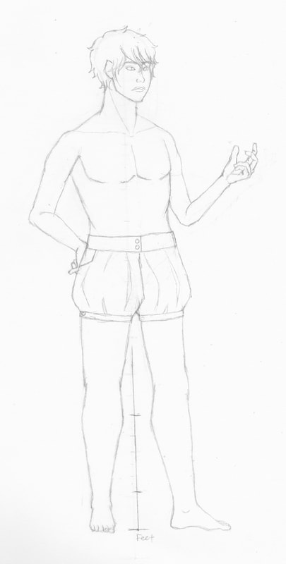 My studio setup is taking a bit longer than I expected. I didn't realize how much stuff I had in the room, so most of my time has been spent getting it out of there, sorting it out, and trashing and recycling things that I no longer need or are in irreparable shape. The bad news is that this part isn't finished. The good news is that there's not much left of this part (which is indisputably the longest and most tedious) before I start actually rearranging and organizing everything (after mopping and dusting, of course). I've also been doing a bit of sketching to keep myself from getting too terrible while I do this. My command of hands is terrible. Not command of my hands, but of drawing them. It's a palm with five appendages, but they're freaking complicated. To be fair, my biggest problem is making them proportionate. They're usually either too big or too small, with the latter problem being more common than the former. I need to practice them before I get started on my next series of drawings. They have an ability to add another layer of expression to a piece if drawn correctly. The guy I have in the sketch above, for instance, has a left hand that's a bit too big for him (he's tiny)! At the very least, it does show that I can draw feet (which I don't draw nearly as often). That's it for this post! As always, thank you so much for reading. - Riane
0 Comments
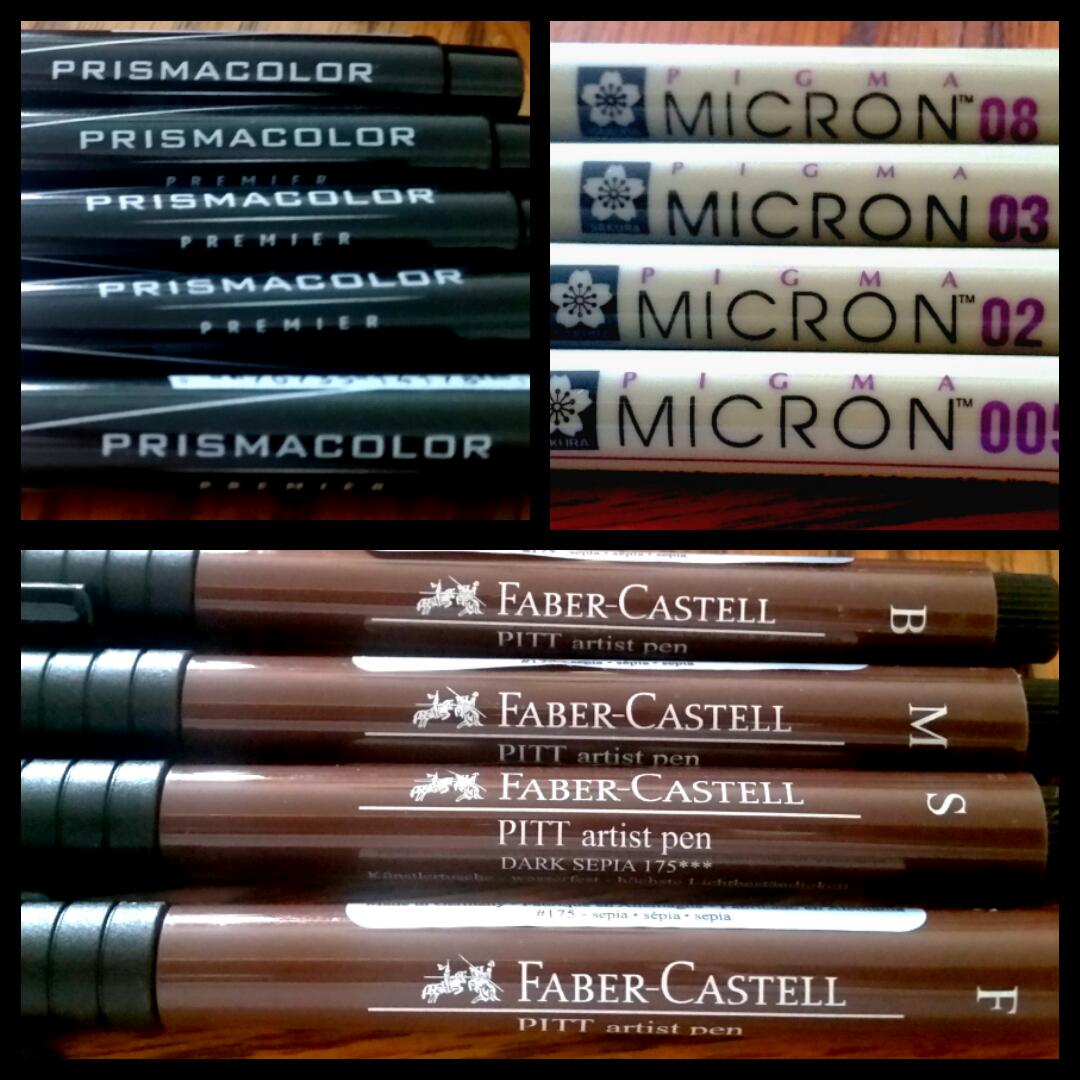 We're trying something a bit different this month. Rather than merely giving you a run-down about my opinions and a price breakdown, I'll be going over a suite of products that I use and their specific niches in my art supply arsenal. Specifically, I will be talking about the Prismacolor Fine Line Markers, Sakura Pigma Micron Pens, Faber-Castell Pitt Artist's Pens, and their functions within the scope of my artwork. Before I begin, there are a few words that will come up often in this "review." While I have used some of these in previous reviews, it's helpful to have these definitions at the beginning. This will make things more concise down the road. These words are:
With that said, let's get started. Prismacolor Fine Line Markers 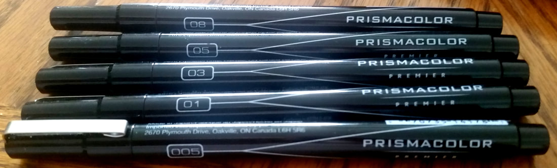 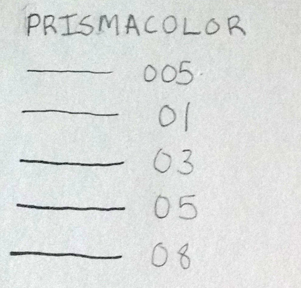 The first ones I'll cover are the Prismacolor Fine Line Markers. I bought them in a pack that included the sizes 005, 01, 03, 05, and 08. They are acid-free, lightfast, permanent, archival, smear resistant after drying, and water-resistant. I usually use these in conjunction with alcohol-based markers, mostly because of the fact that they're listed as water-resistant, rather than water-proof. Needless to say, this makes me a bit wary of using them with watercolor, as it includes copious amounts of ... well, water. They have very minimal bleeding (virtually none if you use thick, smooth paper) and because of their permanence, you can use them with illustration markers like Copics without them budging. You may also be able to use water-based markers with these. These typically do best when stored horizontally, but can be stored vertically as well. The main drawback of these is that with frequent use, they can run out somewhat quickly. If you plan on using them often, buy backups - they cannot be refilled. Otherwise, they're nice markers! I bought my set of 5 at an OfficeMax for $14.99 USD (if you're curious, they're the same price at Michaels), which is a bit high, but Dick Blick has the same one for $11.25 USD and I've found them on Amazon for $7.10 USD. Joann's regular price for these is $17.99. I prefer Dick Blick myself, but go through the channel that you're the most comfortable with. Sakura Pigma Micron 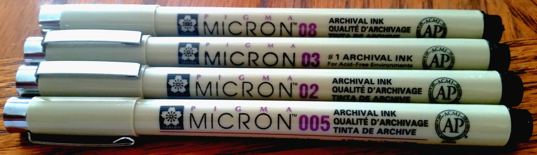 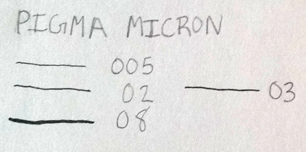 I usually have a variety of these on hand, but my go-to sizes are the 005, the 02, the 03, and the 08. Unlike the Prismacolor fine line markers, the Microns are, for certain, waterproof and I use them for watercolor paintings when I want to line my pencil drawings. In fact, I recently picked up a set of 3 (the 005, 02, and 08) due to my previous ones heading to the art supply graveyard after drying up. They come in a decent array of colors, but I typically get them in black. These markers must be stored vertically with the cap facing upward! At least when they're new. Storing new microns horizontally or upside-down will cause them to deposit more ink than usual. As they get older, you can then flip them cap side down, but never horizontally. I made the mistake of storing them horizontally and my first 005 lasted for only about fifteen days. Fifteen. Freaking. Days. Please store your supplies correctly, everyone. The ink mileage is better on these than the Prismacolor fine liners, but still cannot be refilled, so keep backups. You're probably wondering "Hey, can't you just use these for the same purpose you use the Prismacolor fineliners." Yes, yes I can. However, I would rather use these solely for watercolor paintings, as that means less frequent use and stretching out the ink longer. I picked up a three-pack (the 005, 02, and 08) at Michaels for $9.99 USD, but a similar set (01, 03, and 05) can be bought at Dick Blick for $6.49 USD. Both stores, to my knowledge, carry them in open stock as well (if you're going to do this, however, it's best to order them from Dick Blick). Faber-Castell Pitt Artist's Pens 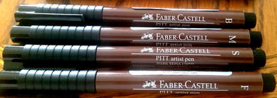 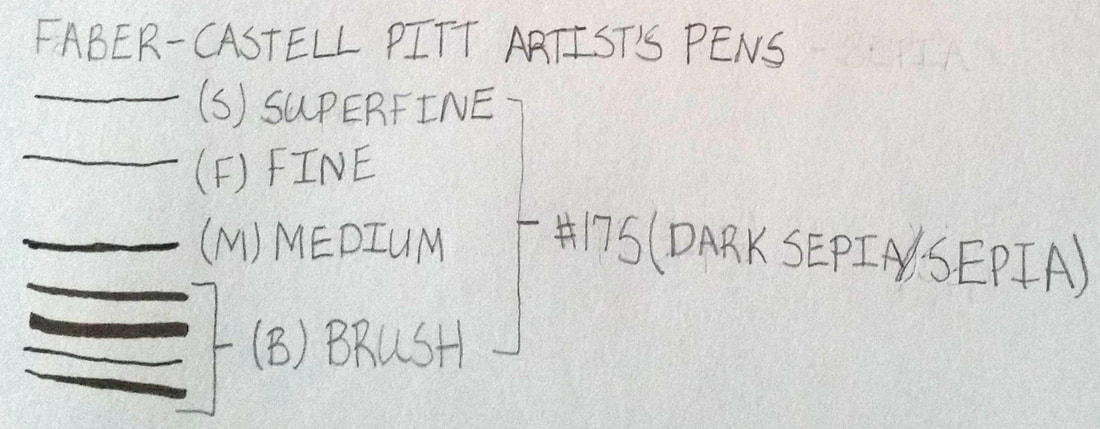 I usually keep a set or two of the Sepia (#175) version of these. The Microns come in sepia as well, and I'll be sure to try them at one point in time, but these were the first ones I tried and I fell in love with them. This particular set comes with the nib sizes Superfine (0.3mm), Fine (0.5mm), Medium (0.7mm), and Brush (1.8mm). They're filled with India Ink, so they are smudge proof when dry, in addition to being archival, lightfast, acid-free, and waterproof. These are used for when I want to line my drawings, but I want the lines to look softer and more grounded against the media that I use to color (usually watercolors). I ink with the Superfine, Fine, and Medium pens, and then I use the brush pen to vary lines wherever needed. For these, it's imperative that you store them horizontally, so they're a bit easier to store than the Microns, at least for me. I just keep them in one of my various pencil cases and put them somewhere safe. As far as ink life is concerned, your mileage may vary. I have parts of a Manga set that came with 6 brush pens, a black Superfine liner, and a Medium liner that I got in high school (around 2010) and I can use the majority of that same set to this day (Cold Grays III, IV, and VI (#232, #233, and #235) and Warm Grays III and IV (#272 and #273), if you're curious). However, the black liners have long since dried up and so has the black brush pen. To be fair, I used the liners and black brush pen much more often than the grays and they did last a long time before drying out. The first sepia set I bought was from Joann for $12.99 USD (there was a 25% off sale, so I actually got them for $9.74 USD), and the second was from Michaels for $14.99 USD (I think there was also a sale on this at the time, but I don't remember the percentage off). Dick Blick sells this set for $8.57 USD. It's listed on Amazon for $12.95 USD, but if you have Prime, it's $9.40 USD. More General Rules
As always, thank you for reading. - Riane Alexander
 I know that I didn't post last week. As much as I like to keep a consistent schedule for the blog, I've been doing things to better prepare myself for doing more (and better) projects. For a while, I've been actually making my art in a place that was, essentially, my bedroom; it's a jumbled one at that. It gets awesome lighting because about 75% of the wall is window, but it's getting a bit of an overhaul to make it feel larger, efficient, and most importantly, organized. This includes getting out old, large, damaged, bedbug-infested furniture and treating the area, putting furniture together, and putting up window treatments (yes, I am surprisingly competent with a drill). I also have a massive closet to clean out and take down, because it takes up way too much floor space. The main task, to me at least, is making a clear distinction in the room between my studio/office space and my sleeping area. This is mostly because I can leave the distractions that I would normally have in my bedroom (television, books, music, etc) in the leisure area. Also, there would be less clutter. I like less clutter. Not surprisingly, this rearranging is going to take quite a bit of work, dedication, and time and this will result in infrequent posts and less time for my art at this point in time. This does not, however, mean that I am going to stop posting or making art. It just means that I'll only post when I have a significant update on anything. If this happens to run into this month's Last Wednesday Review day (which is the 30th), I will still post that. I will also make a post marking the return of the regular blogging schedule. I love you all so much and I appreciate your understanding. As always, thank you so much for reading. - Riane Alexander
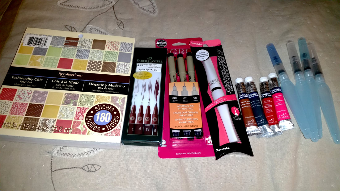 I had an idea for a new project, so I went to get some supplies, along with some things that I just wanted to try. Some of these are things that I have already tried and needed to replace, namely the Faber-Castell Sepia fine liners, the Sakura Pigma fineliners, the Zig Wink of Stella Brush Pen in Clear, and a few tubes of Winsor & Newton Cotman watercolor (Permanent Rose, Vandyke Brown, Payne's Grey, and Alizarin Crimson Hue, the last of which I have as a half-pan in my 12-color Cotman travel set. I bought a set of Pentel Aquash water brushes, mostly to give them a test drive. It's something I can put into a Last Wednesday Review one day, so I need to do a few trials before I can form an opinion. Well, the watercolors help, ha ha. Inspired by some of my favorite artists, who incorporated patterned origami paper into their drawings and paintings, I decided to have a go at something similar with card stock and patterned scrapbook paper. The paper I bought came in a pack of 180 sheets and has several different patterns in it, mostly floral. Normally, I hate floral patterns, so this paper is definitely gorgeous! This project may or may not tie into my comic, Cindertown. The tubes of watercolor aren't really that special. It's a brand I've reviewed already (Winsor & Newton Cotman) and I like them. These were merely colors that I felt were needed in my collection, especially Payne's Grey and Permanent Rose. Similarly, the Faber-Castell Sepia pens and Sakura Pigma Micron fineliners were ones I've had for a while, so I bought new ones to replace those that have dried up. I will review these eventually. Lastly, the Zig Wink of Stella brush pen is a backup. I had one already, but it's always good to have a spare of something you love to work with. These pens give a subtle shimmer to pieces that require subtlety. I could do a review of these, but I would also like to do a post about how to set them up, so I'll probably add the latter as bonus content. For the most part, it was fairly productive! I look forward to a busy weekend. As always, thank you for reading. - Riane Alexander
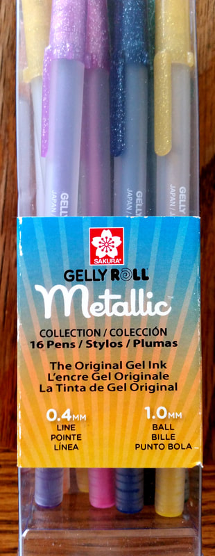 As a relatively new staple in my fashion and costume illustrations (when I do them), and as accents and highlights to portraits and other artwork, these pens became my friends almost immediately. I exclusively used the White gel pens when I started using this brand, then I bought a pair of the clear Stardust Glitter pens, and then bought the set of 16 Metallics, the package of which is in the photo above. While I'm not one for kitsch, I do like a a little bit of glitter or shimmer if the project I'm working on calls for it (well, unless you count a certain Horseman of the Apocalypse *cough* Conquest *cough* that I drew a while ago), so these do the trick. As mentioned earlier, I have three types of Gelly Roll pens: 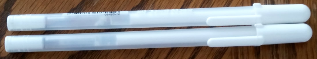 These were the first Sakura Gelly Roll pens I used and I love them to pieces. Before these, I used White-Out, or correction fluid, pens. However, I was skeptical about whether or not they were archival. When I read the package for the Gelly Rolls at Jo-Ann, I noticed that the packaging said that these have archival ink, so I grabbed them. Their application to the paper is smooth and quite opaque. They take a bit of time to dry down, but I also had that happen with the correction fluid pens, so it's not that bad. The fact that other fashion illustrators also use them was also a deciding factor for me. The second type of Gelly Roll I use is this: 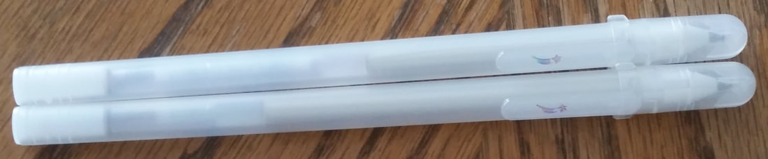 These are a pair of the Stardust Glitter Pens. I have them in Clear, which is basically a silver glitter in a non-pigmented gel. On Amazon, it says that the glitter may wear off at some point, but if you protect your artwork well (using a fixative or protective covering) you can prolong the amount of time it stays on. 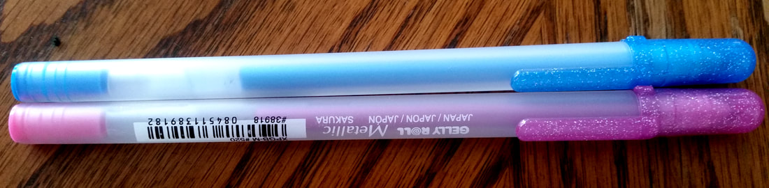 These are the Metallic pens. As the name suggests, the ink is meant to look like metal on paper. The result looks more like a finely-milled shimmer, but that's okay. I love these pens and they add just the right amount of sparkle.
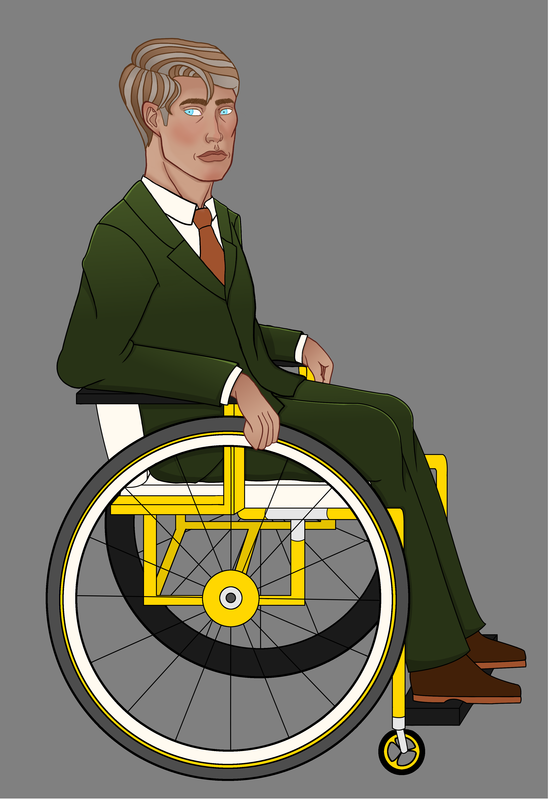
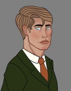
The best part is that they also work on darker papers, which I use in portraits sometimes. These are also archival, which is always a plus for me. They do take a little longer to dry down than the white gel pens, so work from the side of your non-dominant to the side of your dominant hand. Be careful. As far as price is concerned, these are moderate to expensive, but you can get good deals on them, especially online: For the White Gel pens the prices I usually find them for are: Pack of 3 at Jo-Ann: $5.99 USD (you can get them 40% to 50% off, so it often comes to $3.59 USD to approx. $3.00 USD) Pack of 3 on Amazon: $5.56 USD (there is also a $9.29 6-pack) Singular at Dick Blick: $1.25 USD ($3.75 USD for 3) Singular at Michaels: $1.99 USD ($5.97 USD for 3, but often go on sale) For the Clear Stardust pens: 2-pack at Jo-Ann: $4.99 USD (will often go on sale for 40% off, or $2.99 USD) 2-pack on Amazon: $3.50 USD (Warning: this is an add-on item on Amazon) 2-pack at Dick Blick: $3.45 USD For the Metallic set (individual price also shown, if available): 16-pack at Jo-Ann: $32.99 USD ($19.79 USD with a 40% off coupon or during a 40% off sale) 16-pack on Amazon: $12.69 USD 16-pack at Michaels: $24.99 USD (I actually bought these for $14.99 with a 40% off coupon)(singular, $1.99 USD) Singular at Dick Blick: $1.25 USD (their 10-pack is $12.46) Overall, these are very nice pens and I love working with them. They apply smoothly, for the most part, and the ones I have that are said to be opaque are actually opaque (the metallics and white gel pens - the Moonlight pens are also supposed to be opaque, but I haven't tried those). Overall, I give these pens a 9.5/10. Gregor's design is coming to an end. All I have to do is work on his wheelchair, which shouldn't take too long. His suit is finished and I included his suit buttons (it took me long enough) and wedding ring (it's tiny, but there). I'm glad that I took the time fight against the lag I got from my computer. He's looking quite spiffy! I'm glad that I decided to go with the olive green for the suit, where I usually go for charcoal grey or a bright color; it suits him well! Yes, that pun was intended. 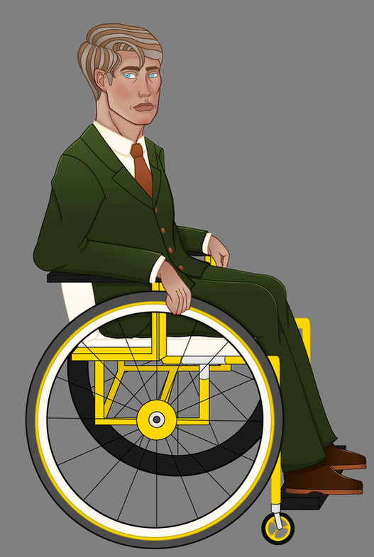 I also inked Callan's mother, Hotaru Abe-Burke this week: 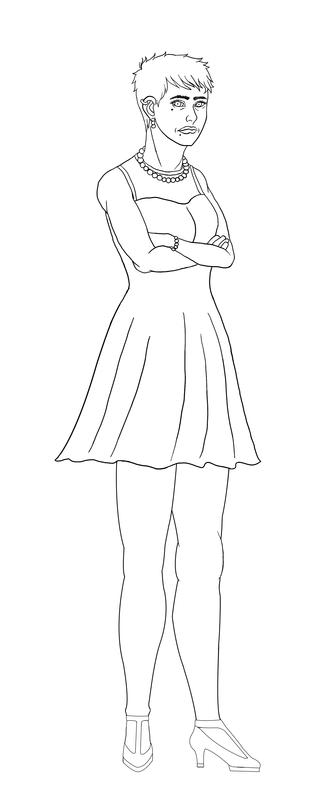 It didn't take that long, mostly because I'm used to doing this, but also because her design is relatively simple. As usual, I'll be changing things as I see fit when I start coloring her, but this is what she looks like with just the ink layer and a white background. Those changes will mostly be around her eyes and right ankle. Why do I always mess up the eyes? I have no idea, but this is the fourth time I've done this and I really need to work on getting the hang of it! This week has been moderately productive! I'm actually glad to have gotten this done for the week. I hope to have more character designs, along with a few personal drawings (that is, non-Cindertown drawings), done by next week's Saturday blog post. Until then, thank you for reading, as always. - Riane Alexander
 I was finally able to get GIMP to run better. It's not perfect; there's still some lag every once in a while. However, I managed to do Gregor's suit and start on his hands (which I should have done while working on his face and neck, but didn't). He's looking nice so far - I just need to finish his hands, shoes, eyes, shirt, tie, and wheelchair. Due to it being the most complicated of the bunch, I'll shade and highlight the wheelchair last. He also needs buttons on his suit, as I am a forgetful person who never drew them. I've gotten to the point where nearly anything else I do with writing from now on will have spoilers, so I can't show that to you, at least not right now. On that front, I just ask of you is to trust that I'm smoothly going through the writing process. I'm doing well! If everything goes well, I will show full outlines, concept art, and edited scripts in the future, when I've gotten through more of the story. While this doesn't have much to do with the comic, I've also been working on a bit of an experiment: 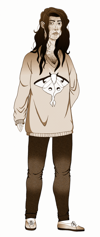 Sepia screen toning! Isn't it neat? While making some rounds on the internet, I came across an interesting tutorial and thought "I wonder if that could work with screentoned drawings." As you can see, it does - kind of. While working on the comic proper (and a few pieces outside of it), I'll do more with my new findings. For now, you can enjoy Gealach in this style. That's about it for this week. If you want more updates, you can follow me on my Instagram, Twitter, and Facebook pages, or the Cindertown social media pages: Instagram: http://www.instagram.com/cindertown_comic Twitter: http://www.twitter.com/CindertownComic Facebook: https://www.facebook.com/Cindertown-Comic-107856139846643/ As always, thank you so much for reading. - Riane Alexander
 For the most part, my Smackjeeves site is finished and ready to plop things in as I finish them! While Weebly is mostly click-and-drag with a small amount of code, Smackjeeves is much more code-based as far as website-building is concerned, so there was a bit of a learning code (and some frustration at times).
I used a public template from Smackjeeves, then went to town on it with everything I've learned to make what you see here! I'm glad that everything is (mostly) finished here, because it makes it easy to just pop everything in when I start uploading the comic pages. Speaking of those, I'm doing the cover and planning out the first 5 to 10 pages as I type this out! This is something that I've wanted to do since about the 6th grade (around the age of 11 or 12 years old), so I'm working my hardest to get things written, drawn, and uploaded. Unfortunately, I won't give out the website URLs until I actually start uploading the pages. The reason for this is because I want as much of each website to be populated with as much as possible before you get to see them in their entirety. The game plan, after I finish the initial pages and put them on the site, is to upload on Thursdays. I hope to upload every week, but I may start out with uploading biweekly, then graduating from that as I feel more comfortable getting a full schedule together to make time for both this blog and the comic. In the meantime, you can follow my progress on the World of Ri Art social media pages, or you can follow on the Cindertown pages: Twitter, Instagram, and Facebook. As always, thank you so much for reading. 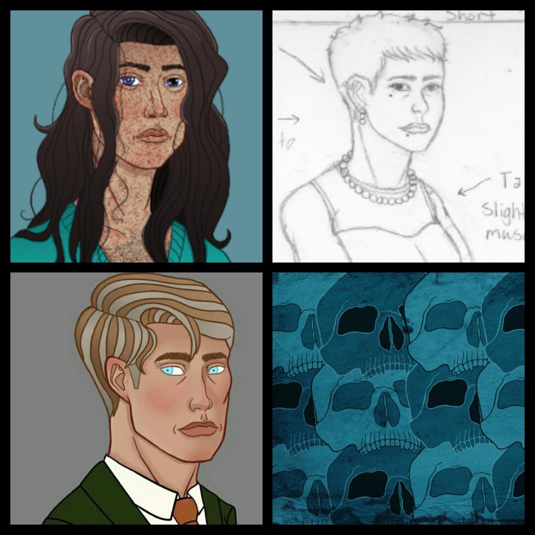 While I haven't been able to do everything done that I wanted to do this week, I've done about 80 percent of it. I'm glad that I was able to do most of it, but the thought of that other 20 percent left undone is bothering me. That said, I have a few updates: 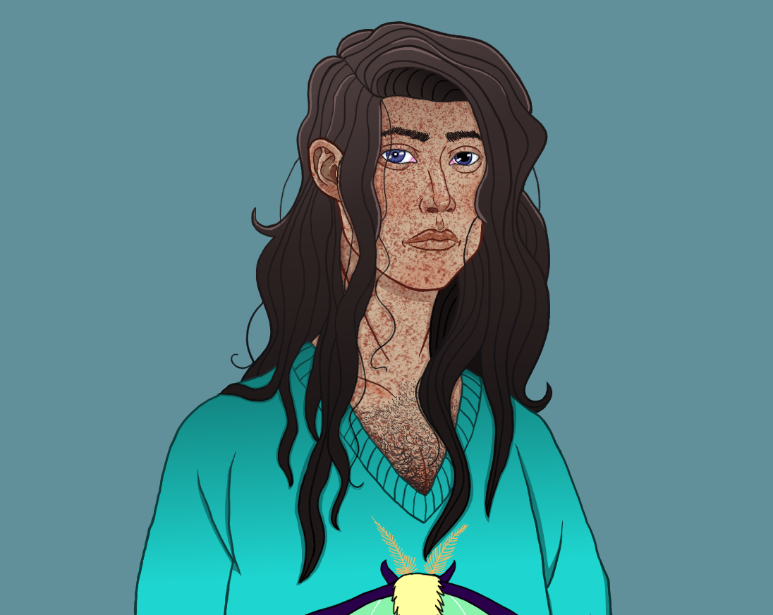 I edited Gealach to make his freckles look a bit more natural (I also made a new brush for them in GIMP). A slight Gaussian Blur has also been added to said freckles to make them look more like part of the skin. 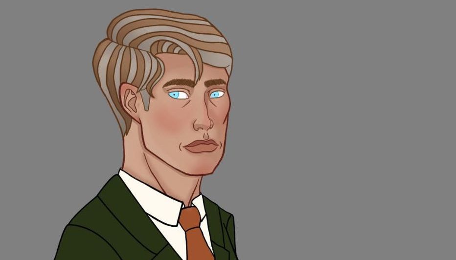 I was able to do more with Gregor. While I couldn't finish him like I wanted, he's looking better. His hair is finished, with shadows and highlights added, and I colored the line art in his hair, face, and eyes. 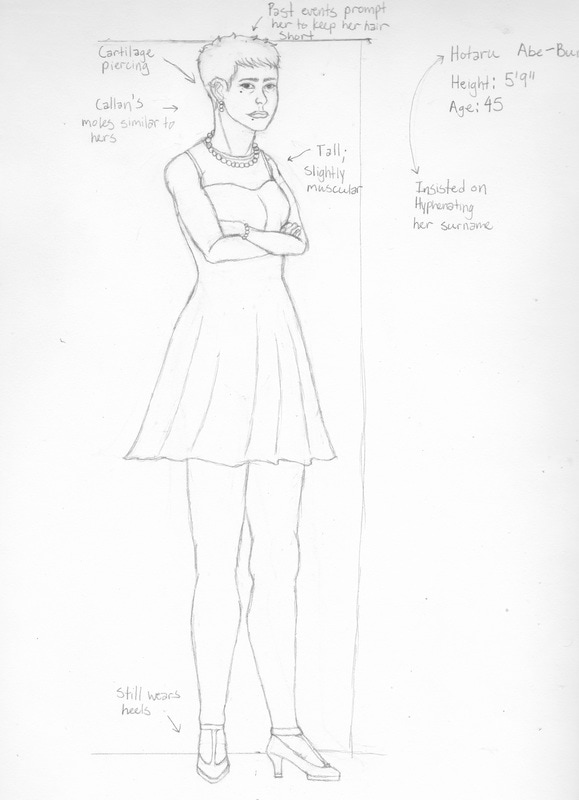 Callan's mother has been designed and sketched and I will color her after I finish Gregor. Her name is Hotaru Abe-Burke. I'll put up her "Meet..." article next Saturday. 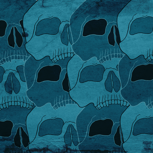 You've probably noticed that I didn't do a Last Wednesday Review last month, and I apologize for that. I've been busy setting up everything for the comic websites (both a Weebly and a Smackjeeves) so they will be ready when I start putting things up. I more or less know the trajectory of the story, so when all of the characters come together, all I have to do is "paste" them into the story (alright, it's nowhere near that easy - but you get the idea). I will also start putting progress on the comic's Instagram, Twitter, and Facebook pages. If you would like to follow those pages, they are: Instagram: @cindertown_comic Twitter: @CindertownComic Facebook: Cindertown Comic I will update these at the same time I update my World of Ri Art stuff for now, but that will change when I start uploading the comic pages. However, I will also be using these to announce updates like website progress and Smackjeeves news; this will be exclusive to the Cindertown pages only. As always, thank you for reading. - Riane Alexander
 This week, I've been working on writing for the comic and website elements. I'm still progressing on Gregor, but the story of the comic is more important right now and I've already gotten down the main characters' personalities and interactions with secondary characters (mostly), so actual colored designs will be going up at a slower pace as I write that out. The portraits and full-body colored versions of the characters will be going on the comic website, so I'm making the effort to transition over there. When it's done, it's also going to have its own social media and Smackjeeves pages, so I'll be making the elements for those, as well. I've had quite a bit to do this week, most of it on Google Drive and Weebly's CSS editor - this means I've also been teaching myself some simple coding. It's frustrating, but also fun and fruitful. I've also been using Inkscape more often, which is always a good thing to me. In this case, I've been coloring and vectorizing hand-drawn ideas with a combination of Gimp and Inkscape, respectively. The skull pattern with the texture overlay is a pattern made from the skull logo above in Inkscape and put into Gimp for textures and effects. If you ever need textures for a digital project, wildtextures.com is a nice place to find them, by the way. It's handy and it's free for both commercial and non-commercial use and the textures are high-res. This is also a good place to insert a bit of wisdom. When you use elements from other websites, especially free elements, be sure to find out whether beforehand whether or not they can be used commercially. I've been using textures from bgfons, which is a great website if you need backgrounds for your website, but is actually under the license "Attribution-NonCommercial 4.0 International." This means that anything from this site can be used for your website, but you must attribute what you used (in this case, linking back to the page where you downloaded the image) and, most importantly, you cannot use anything on the site for commercial use. While I usually research and change to abide by copyright laws, mistakes happen and I apologize. It makes me a hypocrite to talk about copyright licence violations and art theft while I'm not properly abiding by it myself. In light of this, I will make changes to anything I used bgfons.com elements to make sure I'm not using them commercially. By the time this gets to you, the site graphics will look slightly different (or very different, depending on how you see changes). I should have sketches of a few more characters (Callan's Family, mostly), along with a finished Gregor and an edited Gealach within the next week, give or take a couple of days. As always, thank you for reading. - Riane Alexander
 I went back to working on the design for Gregor Maughan this week. I've mostly been working on his face because I kept messing up and re-trying shading techniques, because he started looking a bit like a casket-ready corpse. Though I'm not entirely satisfied with how he looks at the moment, he looks much warmer than he did initially. Coloring the line art around his face helps bring it together. Highlights and rim lighting still need to be applied to his face (and shade the rest of him), but I'm ready to move on to his hands, eyes and hair (I usually do clothing and shoes last - he also has the wheelchair, which will be shaded after the clothing). While Gimp is still running slow on my computer, I want to power through to get everything done. I'm going to be designing Callan's family (Grandmother, Parents, Brothers, pets) over the next few days/couple of weeks, along with the rest of Gealach's family (Mother (deceased), Aunt, pets) and other recurring Cindertown residents. There are characters that I won't tell you about until certain points in the comic - these are either characters that would spoil the story for you or minor characters put in merely to add to the setting's local color. Setting-wise, Cindertown is in a fictional area, but I want it to feel like everything either has a meaning (either symbolically for the reader or culturally for the characters) or has some sort of history of the town or link to a character's past. Many of the design ideas I have for the town proper (well, the titular setting) are borrowed from Victorian and Art Nouveau architectural elements, for instance. I'm also developing accounts of the cultural events and celebrations that I think the residents of the town would find important. These are things that I have to do while writing, because I want them to have significance to the main story. I'll describe things in more detail once I start uploading setting designs. For now, I'll keep working on Gregor. As always, thank you for reading. - Riane Alexander
 As far as drawing is concerned, I haven't done much of note this week. Gimp has been acting up with me (I'm trying to figure out what's wrong with it. I probably will need a new computer in the near future, as well). On top of that, I've had severe allergies for the past few weeks and hay fever this past week, so I needed to do a bit of self-care. However, due to having a comic in need of more than character designs (i.e. more background story and actual scripts), I've spent this week paying attention on that front. Among Adobe Story, Google Docs (almost all of the Google Drive apps, actually), Word, and a notebook (mostly for planning the cryptography puzzles and tiny, intricate details in the comic), I'm building up a world that I'm becoming increasingly satisfied with. There are more character designs coming up, of course. I still need to design Callan's family (his grandmother, parents, and brothers), Gealach's aunt and mother, and more Cindertown residents. I also need to finish coloring Gregor. On top of this, I'm still working on its website (the website's look and feel will hopefully make up for the amount of time I've been changing and re-changing its design). I've been doing research into Smackjeeves and what it offers, so I can go in knowing what I need to do when I start uploading there, as well. This week has been less productive than others overall. I've been getting things done, nevertheless, so you'll see very few complaints from me. After all is said and done, the background work is just as important, if not more, than the finished product. As always, thank you for reading. - Riane Alexander P.S. If you want to see the latest information, check my Instagram page. When I have updates, that's the first (and sometimes only) place I post things.
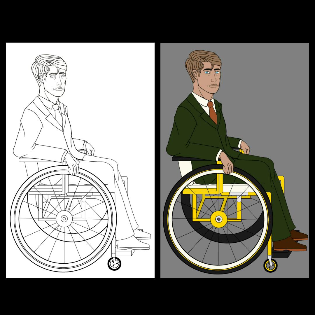 I haven't been on social media much this week (Instagram, Facebook, Twitter, etc.), so this is an update post for Gregor Maughan's ink and flat colors. He's turning out better than I thought he would, so I'm as happy with it as I can be. I'm usually a bit skeptical after going over the inked designs with flat colors. I know that the finished product will look different with all of the shadows and highlights, but the colors look slightly "muddy" at this stage. Partially, this is because everything is colored in its base mid tone. However, there are also several earth tones in this one. While I think they're basic, they fit the character, and his eye color also pops more with the color scheme. I broke up the dark olive greens and browns in his clothes and shoes with the yellows/gold, silver, and off white in his wheelchair. I also tried to pick wheelchair colors that could go with nearly everything. Overall, I'm not hating it! Like Gealach's freckles, I'm adding smaller details while I'm shading and highlighting, such as his gray hairs. Detail work tends to be easier when I do that, mostly because I can blend those features in with shadows and highlights when need be. It also helps me to see everything come together at that point. The individual ink and flat color images will be put on my Instagram, along with the side-by-side comparison above. As always, thank you for reading. - Riane Alexander
 The Canson XL series is a range of products that I've wanted to try for years. It's said to be a student-grade line with leanings toward features that interest professional artists. As a result, they are relatively cheap supplies that are also acid-free. Pieces on acid-free paper can be kept longer, as acidic paper tends to yellow, fade, and wear over a short period of time (even when stored in a dark area). I will give my honest opinion on the product, list prices, and give my rating at the end. Let's get started! I mentioned earlier that this sketchbook has acid-free paper. While I only do initial sketches and roughs in these (I have both the 9" x 12" and the 11" x 14" sketchbooks), I like being able to keep my sketches safe. Having sketchbooks as a sort of archive gives me a sense of where and what I've improved and what I need to work on. They have a durable wire binding on the side (9" x 12" and 11" x 14"). While it's a bit uncomfortable for me as a left-handed person, I find that fold-over books are far too easy for me to pull apart with regular use and hard-bound sketchbooks rarely come in sizes larger than 9" x 12". Also, spiral sketchbooks work better for me when working on pieces that call for the landscape orientation. The front cover is thick paper and the back is a medium-thickness cardboard. This makes it less cumbersome and easy to put in a bag for travel (well, at least the smaller one), but also more prone to moisture from outside sources. I personally just put my sketchbook in a separate plastic bag if I'm traveling with it anyway, because Texas weather will do what Texas weather wants to do, meteorologists be damned - I also carry a water bottle when I go out, especially during Spring and Summer. I love the paper itself. It's described as white, but it's really what I classify as a warm white or off white. In all honesty, I don't have a preference between this and a "pure" white, but the natural tint does make it look a little more "professional" and refined. It's described as medium-tooth, which is the best for graphite pencil, but also nice when it comes to charcoal or pastel. I also want to point out that this is 50 lb/74g paper. This means that while Canson ranks the Sketch books usefulness for Pen and Ink as one star/Good, there is still a chance for bleeding. It erases well, especially when you consider that I'm heavy-handed and erase often - this also means it can take it's fair share of abuse before becoming overworked. Each book that I have contains 100 pages. If you live in the U.S. and are concerned about buying products made here, then you'll be pleased to know that these are! In terms of pricing, these can come quite cheap, considering what you get. I personally bought mine from Michaels, where the 9" x 12" is usually $12.99 USD and the 11" x 14" runs for 15.99. However, there was a sale for Canson products when I bought them, so I ended up buying one and getting one for 50% off. Their 5½" × 8½" is normally $8.49, if you're interested. Dick Blick has the 9" x 12" for $5.72 (USD), which is a much better price, but they don't seem to carry the 11" x 14." Instead, they sell a 5½" × 8½" (3.29 USD), a 18" × 24" (11.29 USD) and a landscape version of the 9" x 12" (also $5.72 USD). All of these have 100 sheets, except for the 18" × 24", which has 50. On Amazon, the 5½" × 8½" is $9.05, 9" x 12" is $10.10 USD, 11"x14" is $12.70 USD, and the 18" × 24" is $14.98 USD (these are the prices for the wire-bound versions). If you have Amazon Prime, you can get free 2-day shipping during checkout, which is nice. I've included the links to each store's website (purple text). Aside from the wire binding, which is inevitable and minor in the grand scheme of things, I have no real gripes. That being said, this product gets the highest rating I've given a product thus far, which is a 10 out of 10. It's among the best sketchbooks I've ever used! As always, thank you for reading. - Riane Alexander
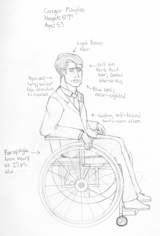 As a widower and paraplegic with an only child, Gregor needs extra hands at home and at his shop, Maughan Tailor and Haberdashery. Because of this, Gealach works as a tailor at the boutique and helps around the house. While he would never explicitly tell him this, he's happy to see his at home and have an interest in the family business. He was a busy, jittery child who liked creating things. His grandmother taught him how to sew, tailor, and make clothing patterns to keep his hands from being idle and to let him create functional items. Gregor became so enamored that he became an apprentice to a tailor in early adulthood, and eventually becoming a full employee at that shop. While there as an apprentice, he met Violet, the daughter of the shop owner. Though described as "squirrel-y" and "touched in the head," by her father, Gregor didn't care and saw Violet for the kind woman she was. The two of them got married when he was 24 and she was 21. In a car accident at the age of 27, his spinal cord was severed. The wheelchair didn't mess with his sewing abilities, but it did bother him when it came to taking measurements. Still, he was an asset to the shop and would work there until he moved to Cindertown with his wife at the age of 30, when Gealach was roughly two years old. He opened his own tailor shop and boutique in the relatively small town. Nowadays, he can usually tell a person's size by looking at them and identifying problems with the fit of the clothing they came in wearing. He loves interacting with other people, to the point that it energizes him. Above anything else, he loves his son and appreciates his help (but kind of wishes he would cut his hair). As always, thank you for reading. - Riane Alexander P.S. If you follow my Instagram, you may have seen Gealach's final design: 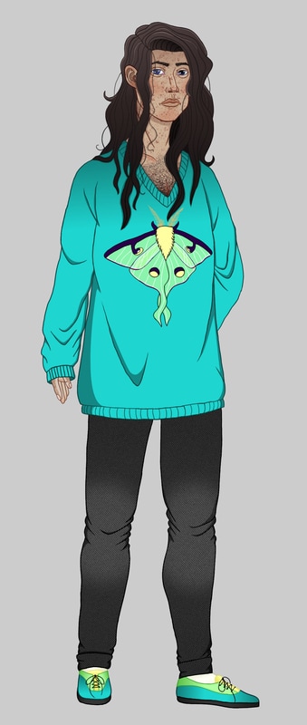 You may have also seen this four-stage progress collage: 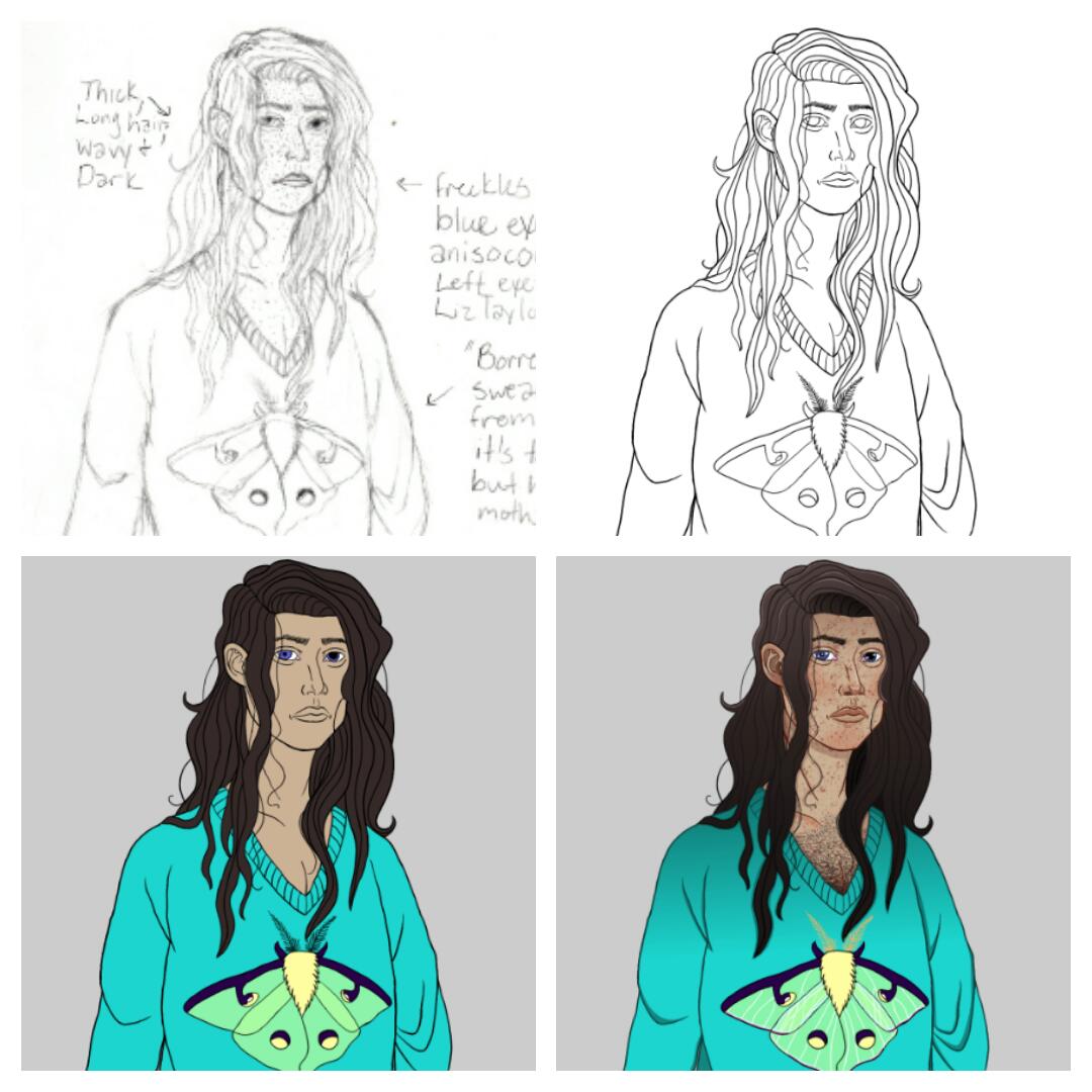 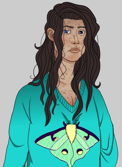 Gealach's Full-Color design is underway! His skin and sweater are mostly finished; there's a bit of detail work that I would like to do on the moth printed on the sweater and I want to add a bit of hair on his chest, because the neckline is low enough to show at least a tuft. I haven't done much to his bottom half (pants and shoes) aside from adding the flat colors. I can also say that about his hair, which I want to add more detail and depth to. I did manage to finish his face (sans eyebrows, which need a bit of restructuring) and had quite a bit of fun doing it. For his freckles, I made a custom brush in Gimp, which I'm proud of (the only downside is that I can only paint with said brush in black, but at least I was able to color the freckles brown by locking the alpha channel and a regular, hard brush). If you follow me on Instagram, I've posted both his regular, black inked lines: 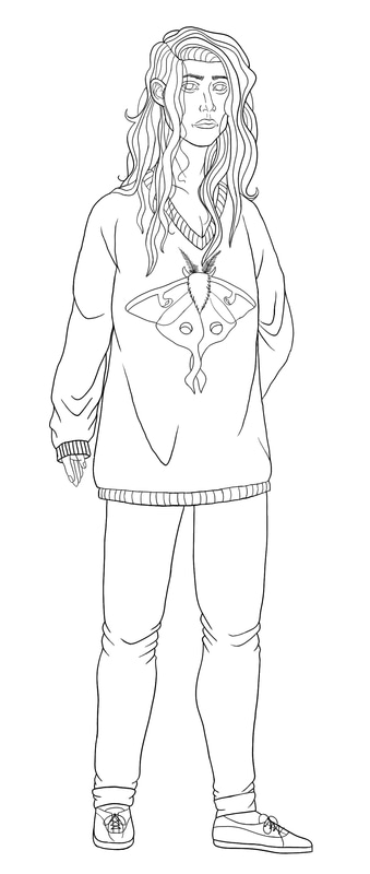 and the flat colors: 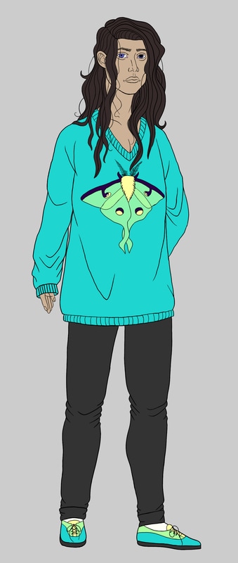 When I finish the design, it will be posted on all of my social media profiles. I will also be going into the designs of the secondary and tertiary characters, which will I'm looking forward to (I'm especially excited to draw the parents of the two main characters). That's all for this week. If you're interested, you can look to my social media pages (most reliably my Instagram profile) for more updates. As always, thank you for reading. - Riane Alexander
You probably remember Gealach (formerly Quacey) if you've been around my blog and social media pages. If you do, you'll probably also remember this sketch: 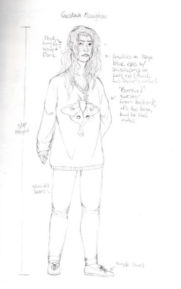 I currently have this sketch in Gimp and am currently inking it. These days, he looks more like this: 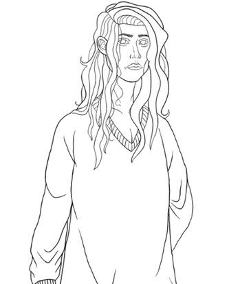 All of the details that I took notes on, like the sweater moth, his freckles, and his unusual pupils, will be added in coloring. I do, however, love the way he's turning out line-wise. As with Callan, there are things I will change once I get down all of the lines, but I like getting a feel for inking the character first. These changes will mostly be to his left eye, eyebrows, and lips ... especially his lips. Along with inking this guy, finishing Callan, and participating in Mermay when I have a moment, I've still been working on backstory and scriptwriting in Adobe Story's cloud (I also do handwritten notes, especially for more intricate parts of the lore). Needless to say, this week has been busy, and busy is the same as enjoyable in my mind. I've been fairly giddy! I posted Callan on my Instagram, Facebook, and Twitter pages (I still need to put him on Pinterest, which I will do today), and I will be posting him on this site's gallery as a temporary resting place. Until the comic's website is up and running, you can enjoy him on my Artwork page in the Digital Art section. This is the full version of him: 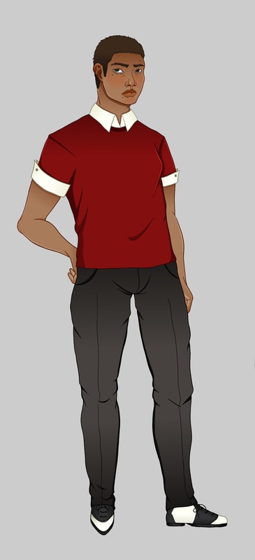 I'm working to keep up the pace, so I will hopefully have Gealach done within the next few days. With Callan, I posted the major steps or "milestones" (sketch, inking, flat color, full color/shading and highlight) of coloring his design in a post on Instagram, so I will do the same with Gealach. I've compiled those four steps into a collage: 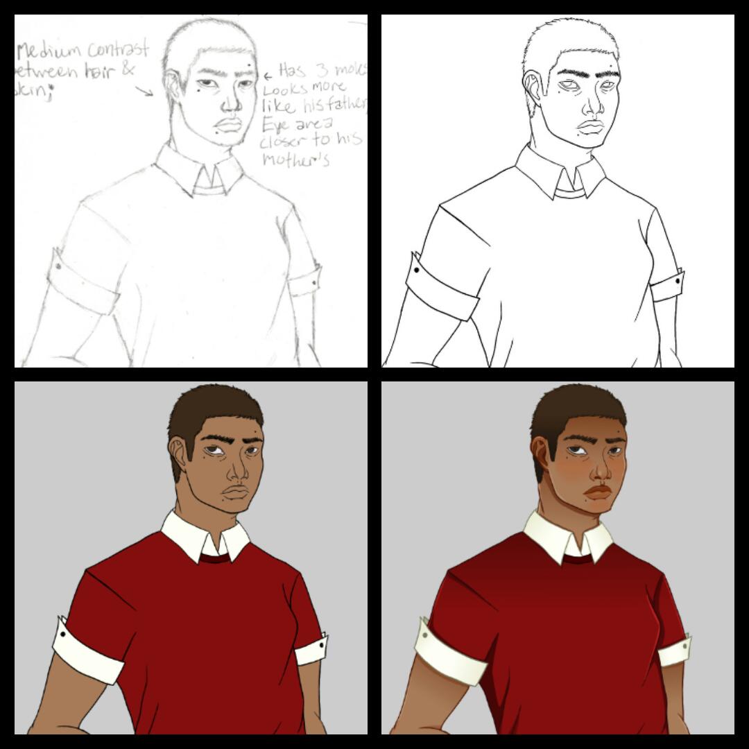 I also updated more often this week on my social media pages. While I try to keep all of my social media caught up at the same time, Instagram is the most reliable of the four to follow if you want to see my latest stuff (followed by Twitter, Facebook, and Pinterest in that order). I hope you all have a nice Mother's Day weekend, and I bid you Auf Wiedersehen for now. As always, thank you for reading. - Riane Alexander
Or more aptly named: I'm actually using my Wacom tablet to draw instead of cleaning up traditional artwork...and more comic information. 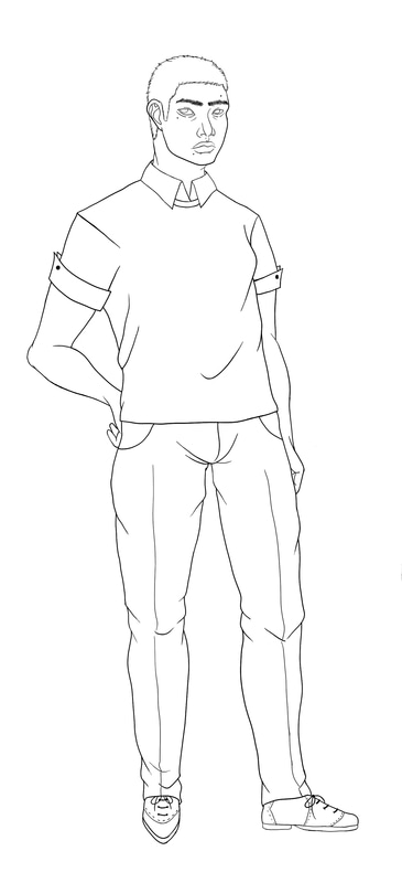 If you read my blog posts about my up-and-coming comic, I am making websites (Smackjeeves and Weebly), and social media pages (at the bare minimum, Instagram, Facebook, and Twitter), for it. I would like to put character biographies on the sites, so I need to make digital art of each character I put in that section, mostly because I think it would look better, aesthetically. Also, having transparent PNGs for each character would give me more flexibility. I spent some time with my Wacom Bamboo tablet to learn the ins and outs of its effects in Gimp. I've had it for years and have only used it to clean up scanned artwork and make a few attempts at coloring and inking (and not doing very well). Though I spent a while on it, I think I've gotten the hang of it and Callan, here is looking great! I'm also going to color him in Gimp due to the boost in confidence I have from the decent ink job. I still have things to learn, like how to vary my lines (also known as using the tablet's pressure sensitivity to my advantage), but I'm able to learn faster now that I have a few basic things done. There are also things in this specific piece to fix, like the upper-left part of his face (mostly that eyebrow), but I'm satisfied with most everything else. I've also been toiling away in Adobe Story (a good resource for anyone else out there looking to write scripts of any kind) writing individual character bios and the script. Gealach's backstory is being fine-tuned a bit to make more sense in the context of the story (and my research of his occupation), so he's taking a bit of time to get just right. However, I'm used to writing and researching, and I actually enjoy it! As always, thank you for reading. - Riane Alexander
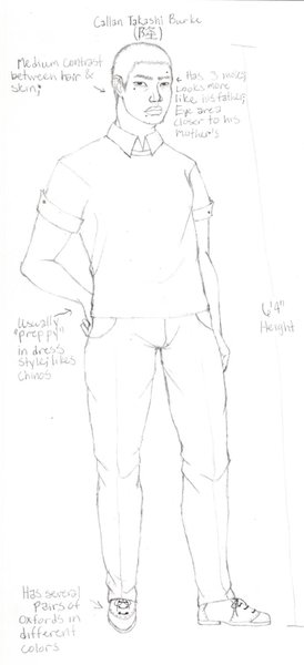 In light of last Saturday's post about my in-progress comic, this is Callan, another main character. While he towers over most of the residents in Cindertown and looks somewhat mean, he is actually a gentle, quiet young adult and a friend of all living things. He's used to simultaneously blending into the background at home and standing out against his family during outings due to his height. Out of a family of 6 (grandmother, father, mother, three children), Callan has been the tallest since the age of 14. He has two older brothers, one of which is his fraternal twin, and one younger brother, all of whom he gets along with. His mother, a former sukeban, or delinquent/boss girl from Japan, is morose and headstrong, while his father is nurturing and slightly squeamish. As a student in his second year at a barber college, he likes talking clients through life's difficulties. Though he's not much for small talk, he is willing to listen and respond in kind. He decided after taking a gap year and overseeing his mother's and father's tasks at the mortuary (at his father's suggestion) that his talents (and stomach) were better suited to cutting hair. His parents are the owners of the Cindertown Mortuary, where his father is a provider of bereavement services, his mother is an embalmer, and his older brother is a crematorium technician. They were a bit disappointed, but didn't push him, mostly because his twin brother decided to get his licence for mortuary work. His middle name, Takashi (隆, meaning "prosperous noble"), was given to him by his maternal grandmother, who brought his mother from Japan in the early nineties. She taught him Japanese and looked after him when his parents had long nights at the morgue. As Gealach's boyfriend, he is a bit wary of the age gap (he's 20 and Gealach's 25), but also enjoys being with him. He doesn't know about his boyfriend's past, but Callan senses a tinge of sadness and fear in him that most people can't. They have a mutual love of animals and between the two of them, there are four cats, a Welsh Corgi, an Axolotl, and a freshwater aquarium (the fish and cats being Gealach's and the Corgi and axolotl being his). His leisure time includes playing with his Corgi (Piccolo), watching his axolotl (Rex), taking photos around the neighborhood, and sculpting tiny trinkets (usually axolotl or sea creature-related) out of polymer clay, which he will sometimes sell on a craft-selling site, due to demand from classmates, friends, and family members. There's more to find out about this character in the comic, so I'll leave this here for now. As always, thank you for reading. - Riane Alexander
 While I'm mostly a traditional artist, I also enjoy doing vector art, mostly because I like the versatility of it. Depending on the techniques I use in the program, I can make cartoon-like images, semi-realism, logos, website elements, and more without having to worry about blurring or pixelation when I resize them for different applications. I'm familiar with two programs: Adobe Illustrator and Inkscape. The latter is the one I use today and I find it pretty comparable to Illustrator. While it doesn't have all of the same features, it is an impressive, powerful, and free open source program. Inkscape's basic features, such as the Beizer Curve tool (or Straight Line tool), Pencil, Star, Polygon, Text, and Gradient tool, are my most used and the most versatile. The parameters of the Star tool, for instance, can be tweaked to create a looped mandala pattern, like the one in the background here: 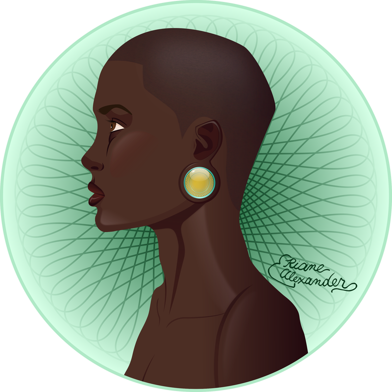 Inkscape also has fairly easy color management. You can either click one of the color swatches from the bottom of the window or the Fill and Stroke panel (Shift+Ctrl+F if you're on Windows; same on Mac OS X, but it can be made to work with the Command Key). The latter can handle Alpha (opacity) well (it's actually just a slider within the panel). 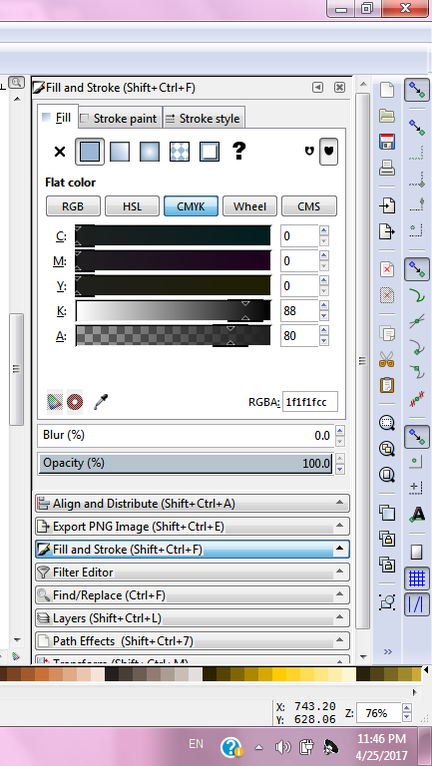 There's also a dropper tool. Though, as a caveat, I will say that if you have the window in its normal configuration, there's an arrow that you have to click to see and select it: 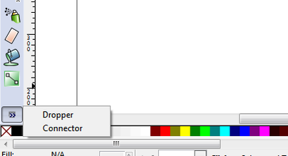 It's still a useful tool, however, if you need to do color matching, so one extra step isn't a big deal for me. Tools like the Beizer Curve tool, Pencil, Polygon tool, Object Sprayer, and Gradient tool, work very similarly to their Illustrator equivalents and are pretty standard. The only thing I really have to say here is that using the Beizer Curve tool can get pretty clunky when you go from a curved line to a straight line, especially if you're using a tablet. I'm not sure if there's another way to do it, but you have to use the shortcut (Shift+L) and that's the only advice for doing so I could find on the internet. If you do detailed work like I do, it will get a bit annoying after a while. However, this is easily overshadowed by the fact that you can make tapered lines by choosing the "Triange In" and "Triangle Out" options. You can even make patterns, copy them to your clipboard, and then choose for it to be extended down the curve. Speaking of detailed work, when you're working with something that requires a lot of layers, it's pretty easy to get a large file. When that happens, the speed takes an extremely heavy bludgeoning. The best thing you can do at this point is to turn off the visibility of the layers with the most detail (any parts with gradients, patterns, or filters, I've noticed). Be prepared for it; save early and save often with all projects, but especially large ones. Layers (Shift+Ctrl+L) are pretty basic in the program as well. At the moment, Inkscape only has five layer blending modes: Normal, Multiply, Screen, Darken, and Lighten. While limited, they're helpful. Each layer also has its own opacity setting. The Align and Distribute panel (Shift+Ctrl+A) is also quite useful and similar to its Illustrator equivalent. You can use it to align and distribute objects relative to the selection area, largest or smallest object, last or first object selected, the page, or the drawing. While you can also do Gradient Meshes at of Inkscape update 0.91, it's sort of a "Secret Menu Item." You have to enable it by editing your Inkscape preferences (Preferences->Interface->Keyboard Shortcuts, search for 'mesh', add, save, replace old file with saved file). From the short amount of time I've spent using it, I found it useful, but only if you want the most realistic look possible. Similar to the "File O' Several Layers," as I call it, Gradient Meshes tend to make your file large enough to slow the speed. My suggestion for doing work that leans toward realism without too much performance dampening is to use the Blur and Opacity sliders available in the Fill and Stroke Menu: 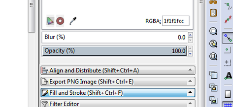 For some reason, blurring isn't as harsh on the program as gradients are, so they're perfect to use more often. While there are more intricacies to the program at large, these are the fundamentals. As I've said, Inkscape is a very powerful tool that's comparable to Adobe Illustrator. Though there is a bit of a learning curve in some areas and the program is finicky with large files, it is solid as a vector graphics program. I enjoy working with it and hope that, in the future, I can make tutorials on things that can be done in it. Overall, I give it an 8.8 out of 10. As always, thank you for reading. - Riane Alexander
 I mentioned in a previous blog post (specifically, my New Years' post) that I was working on two major projects: my Lucid series (which may have to go on the back burner for a bit, but will still be done) and another that I never formally announced. I'm going to be starting a webcomic. This is something I've wanted to do for years now and it will be in the works this year. It's name for now is "Graveyard Melody." I've been working on the story outline and character designs and due to some traits of my characters and story at large, I've also been doing research so that I can write about these traits more accurately (for instance, looking up the ins and outs of what morticians do and the process of making bone china - don't ask, I won't be giving any spoilers). The website for it is currently under development and has been for quite some time. In addition to my social media sites (Facebook, Instagram, and Twitter), I also plan to post the comic on the official "Graveyard Melody" website, along with Smackjeeves and its own separate Instagram account. In fact, you've already seen one of the characters, even though I've changed his name and a few physical features. His name has gone from being Quacey to Gealach, and while he's kept mostly the same look, I've added a few more details, such as his freckles and his anisocoria (enlarged pupil): 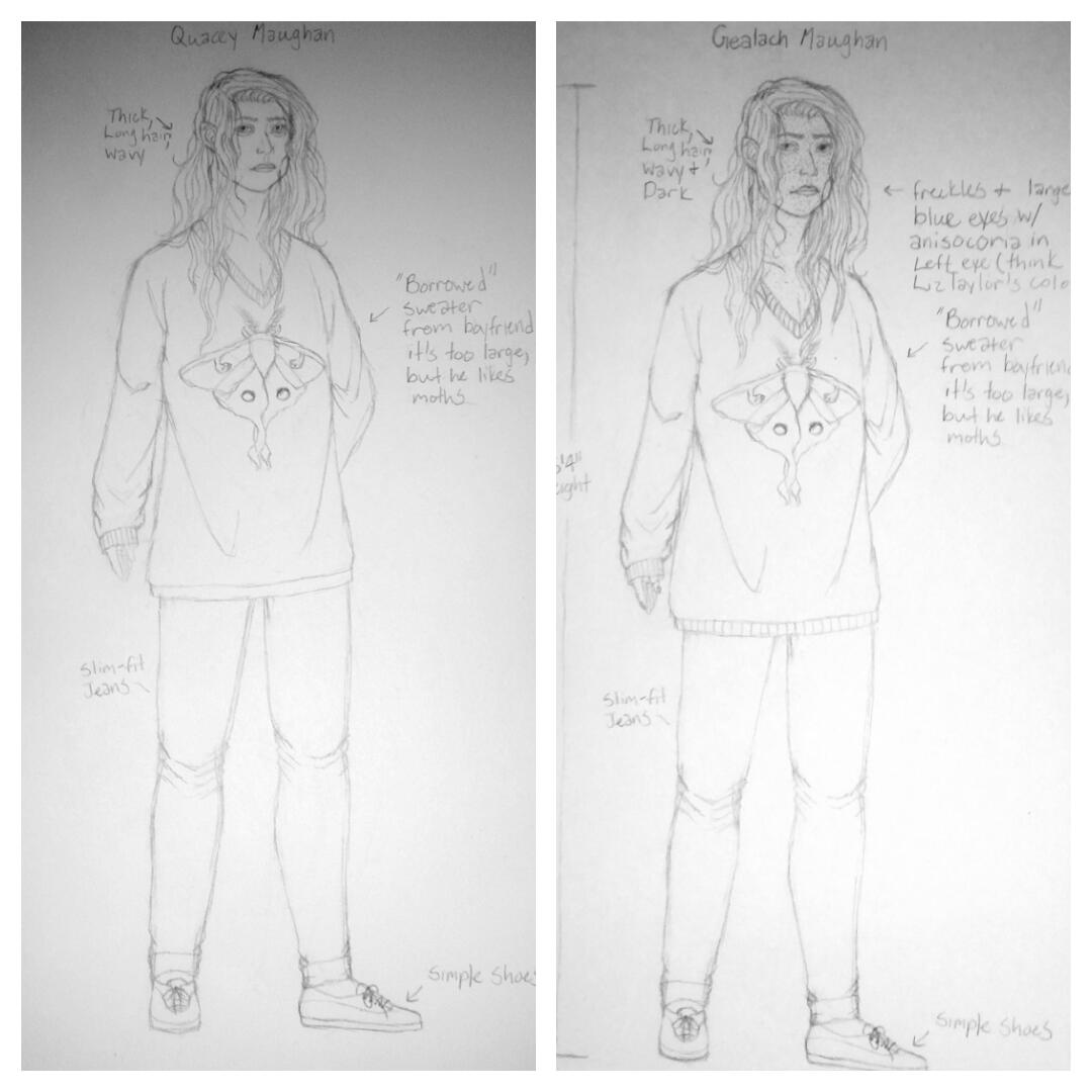 I loved the rest of the design otherwise, but I also loved the idea of him having freckles and his eye is a subtle hint for his backstory and character traits. While the project will come to a slow start and will also progress slowly, I am excited about this. It combines my art with another thing that I'm passionate about: writing and storytelling. Here are a few more details: - It is a Boys' Love comic (male/male relationship), along with being a mystery series. Though, technically, neither romantic partner could be considered boys, really. - While it won't happen often, it will have explicit content. It will have violence and it will have sex, but I'm not a fan of gratuitous amounts of either of these. I will warn people as I see fit. - There are also subjects included, such as domestic violence and abuse, that may hit home for some readers.. I will handle these subjects as sensibly as I can and do as much research as I can. However, as I have not suffered domestic violence myself, I am not going to be entirely accurate. If you come across something inaccurate or seemingly insensitive, please contact me with CONSTRUCTIVE criticism! I cannot stress this enough and I will listen. As a caveat, I am less likely to have a response to you if you haven't actually gone through abuse yourself, unless you're qualified to work with people who have (therapist, psychologist/psychiatrist, social worker, etc.). With that said, as I finish up side projects, I will be slowly working this, as well as my daily schedule. As always, thank you for reading. - Riane Alexander
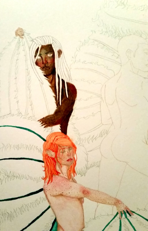 I'm slowly, but surely, coloring my dancers! Slow and steady wins the race (and usually doesn't have to restart), so I'm not too worried. I got off to a bit of a rough start, but one of my dancers is nearly finished (the red-haired one. He needs more freckles) and another one just needs to be evened out more (his eyes, hair, hand, and ear need coloring, too). I figure that if I do one or two dancers at a time, and then color their fans and do the background as I go, the painting will be easier to do, so this is my game plan. It's going well so far, so I hope that I can keep this progress. That's it for now. It's a pretty short post, so I'm going to keep painting. As always, thank you for reading. - Riane Alexander
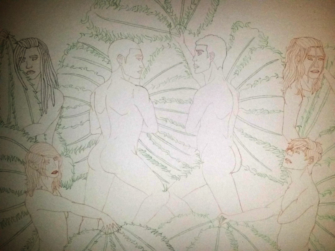 I have finally transferred this drawing to watercolor paper and it's ready to have color added to it! I initially used a 2B pencil to rub on the back of the initial sketch, and then I traced and edited the drawing after taping it onto the drawing surface of the watercolor paper. Afterwards, I traced the (rather light) 2B pencil lines with watercolor pencils to both help me with the placement of the colors and to help me see the lines (while also giving me lines that will disappear) as I add colors to it. I've decided to go with the peach background and teal fan combination. While purple is one of my favorite colors, I just think that teal and peach is a better color combination than purple and yellow (even if they're both pairs of complimentary colors). For that reason, I used a green watercolor pencil for the lines of the fans, because I think it would blend easily. This will definitely be a learning experience, because I contemplated several transferring methods, and coloring will have its own set of challenges. I'm looking forward to that! As always, thank you for reading. - Riane Alexander
I've managed to do some rough visual representations of the color schemes that I've been bouncing around in my head. These are my favorite color combinations (aside from cobalt blue, gold, and white, which I thought would be a bit boring for this one). While they don't look the best, they are giving me a good idea of the direction I want to go in for the fan and background colors. The skin colors were something I planned out a bit already, especially when I was figuring out the facial features of each subject. This is something that I meant to do in Gimp. However, it decided to be mean to me, so I just scanned the initial sketch and printed multiple small copies onto a sheet of watercolor paper. Now that I look back at this, it's actually an advantage. I was able to get a better understanding of how to mix my desired colors, which gives me more confidence going in. Pro-tip (is saying this still hip?): keep in mind that when you're thumbnailing, you're going to make more mistakes than usual. This is because you're essentially using the thumbnails as crash test dummies. Don't worry too much about getting everything exact at this stage. Also, you may not want to use your "best" supplies here, either. Just have fun and don't be afraid to be loose with your strokes. You'll have plenty of time to work out the tiny details on the actual piece (if you plan well). Now I have to answer the (not so) age-old question: teal and peach or purple and yellow? As always, thank you for reading. - Riane Alexander
For today's "Last Wednesday Review" (this is what I'm calling these from now on - it's catchy), I will be reviewing Dick Blick's Studio Artist's Colored Pencils, specifically, the 12 greys set. Before I had these, I didn't have that many grey colored pencils and those I had were all the same mid-range grey that I had to blend with white to get lighter greys and black to get darker greys. While they have their problems, I do think they're a good addition to a collection of colored pencils. As a disclaimer, I did not receive these for PR. I paid for these out of pocket. Any opinions, good, bad, or indifferent, that I express in this review are not contingent on anything outside of my own experiences. With that said, let's get started! What Comes With the Set? 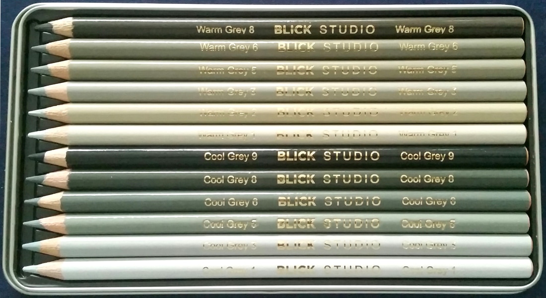 This set comes with 12 pre-sharpened colored pencils: 6 shades of Cool Grey (1, 3, 5, 6, 8, 9) and 6 shades of Warm Grey (1, 2, 3, 5, 6, 8). They're stored in a metal tin with a plastic tray that holds them, similar to how some Prismacolor and Faber-Castell sets are stored. While it isn't a "wild and out there" type of packaging for colored pencils, I do quite enjoy having the metal tin/plastic holding tray combo for my colored pencils, as it helps me keep them in one place and the tins are usually quite durable. Pencil Composition Similar to Prismacolor pencils, Blick Studio Artist's Colored Pencils are wax-based and encased in California Cedar wood. The wax "leads" are 3.8 mm thick and are harder than Prismacolors. This is actually an advantageous feature because they hold a sharp point longer, meaning that you are able to sharpen them less. This also means that they will last longer. However, a problem I've had is that they don't lay down pigment as smoothly as Prismacolor colored pencils. They are well-pigmented and have a decent color payoff, but just keep that in mind. As with any was-based pencil, you can get wax buildup and wax blooms, the former which can be a problem if you want to continue a piece. Both of these problems can be remedied fairly easily with a spray fixative (workable fixatives are great if you want to continue working in areas with too much wax buildup). How Well do They Work? As I mentioned before, they aren't as buttery as Prismacolor pencils because the wax is harder. However, what these pencils lack in smoothness, they make up in pigment load. I find them to be highly pigmented. The darkest grey in the set (which looks to be Cool Grey 9) looks almost black, for instance. They do blend well, but it takes a bit more work to make the coloring as seamless as you can with other pencils. With the consideration that I work in layers, anyway, it's not that big of a problem for me, but it's something to be mindful of. Another thing to be aware of is that if you're weary about things being made outside of the U.S. (I usually don't mind it if the product's quality makes up for it), these are made in the Czech Republic. This is also where the Progresso Koh-I-Noor Woodless Colored pencils are manufactured. I have very few qualms about their origins because both sets are of good quality, but I understand people who have hang ups about it. Lightfastness Like many companies, Dick Blick has the lightfastness ratings of their colored pencils listed on the product page. There are 91 colors in total, so I cannot put them all here (because it would make an extremely large chart). I will, however, give you the ratings for the 12 pencils I have: 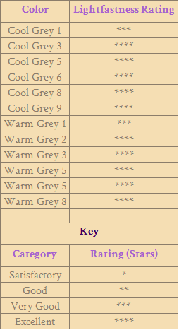 As you can see, they use a star system where the lowest rating is one star and the highest is 4 stars. If you would like to see the ratings for the full range, follow this link. The ratings start after the list of colors under "Portrait, Set of 24." Price and Other Facts
The price on Dick Blick's website (being that this is the only place that sells them) is $9.99 USD for this set of 12, placing them at about $0.83 USD per pencil (this is not counting shipping, obviously). This is also their price for both 12-sets (colors and greys). They also have 3 sets of 24 pencils (regular set, portrait, and landscape) for $19.99 USD ($0.83 USD per pencil), a set of 36 colored pencils for $28.99 USD ($0.81 USD per pencil), a set of 48 colored pencils for $37.99 USD ($0.79 USD per pencil), and a set of 72 pencils for $56.99 USD ($0.79 USD per pencil). The sell a different 72 pencil set for $91.69 USD, which is a good price for a set that comes with a wooden box. The price for their open stock pencils is $0.95 each. There are 91 colors for this brand in total and they also carry a colorless blender pencils, making 92 distinct pencils. Final Thoughts and Rating Overall, I'm happy that I was able to get my hands on these. Sure, they're a bit below my Prismacolor pencils, but the quality is good regardless. I would definitely buy them again and I may get more colors down the road. I give these an 8/10. |
 RSS Feed
